Netflix is one of the most popular streaming platforms in the world, having released over 4,700 original titles with its Netflix Originals label. However, now it seems like the company no longer wants to associate with this branding, as it has removed this branding label from all of its original titles.
I believe that the primary reason why they did this is that the Netflix original niche is no longer profitable, and Netflix knows it. After years of many mediocre originals flooding the platform, the label has started to lose its shine. Many, though, argue that this is a mix of brand strategy and possibly a quiet rebranding effort, but I think there’s more to it.
From Badge of Honor to Red Flag, the Netflix Shows With Netflix Originals Badge Are Not Always Hits

While some people believe this is just Netflix’s effort to simplify the interface and make the platform look cleaner, I think this is because many of the Netflix originals weren’t exactly a hit among the viewers. Even big-budget projects sometimes fell flat. Some viewers have shared blunt takes on the state of Netflix Originals:
They legitimately did have a few good shows (Castlevania etc) but their logo really was a badge of dishonor. If a Netflix Original was good, it was either an accident or cancelled. It's harder to avoid the slop now. 🥲 https://t.co/uDp8agx8BN
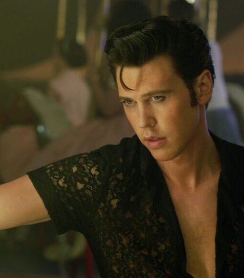
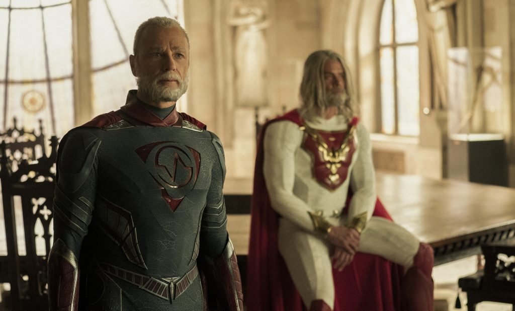
Titles like Jupiter’s Legacy (2021), Marco Polo (2014–2016), Iron Fist (2017–2018), The I-Land (2019), Gypsy (2017), Cowboy Bebop (2021), and Resident Evil (2022) failed to hit the mark, showing that the Netflix Original label promised big, but often under-delivered. As a result of so many misses under its belt, the logo started losing its prestige, and that could be exactly why Netflix is quietly phasing out the logo.
With HBO, Apple TV+, and other streaming platforms pushing high-quality originals, Netflix’s content began to feel less distinctive. The platform that once set the standard for streaming originals now faces fierce competition as shows like The Summer I Turned Pretty on Prime, Severance on Apple TV+, and True Detective on HBO have raised the bar, creating more expectations from the audience.
A Quiet Rebrand? What Dropping the Logo Says About Netflix’s New Strategy
![]()
What’s On Netflix reports that Netflix once relied heavily on licensed shows, but now Originals make up around 63% of its library, making it unnecessary to label each one. Netflix’s removal of the logo goes beyond a simple interface change, hinting at a shift in focus toward its content library.
By quietly dropping the Netflix Original logo, Netflix seems to be signaling a strategic shift. The platform appears confident that its originals are strong enough to stand on their own, letting the titles themselves take center stage rather than the badge. So this is probably why removing the logo could be a strategic move to reset expectations without a formal announcement. Netflix’s most-watched shows in recent years, like Suits, Breaking Bad, and more, aren’t even originals, so highlighting them less didn’t make sense.
The red “N” once served as a quick visual cue of exclusivity, and without it, viewers may need to pay closer attention to distinguish permanent Originals from licensed content that could leave the platform.
Netflix is clearly playing a new game with its originals, and the logo removal is just the start. So, what do you think? Do let us know in the comments!