
When you think of Weekly Shonen Jump, the first thing that pops into your head is that loud, blocky red-and-yellow logo just yelling at you from the cover. But with One Piece, the Jump editors totally ditched their own rulebook and tossed it straight into the ocean. Yep, you heard that right: the magazine editor actually said that when Luffy’s on the cover, the ‘big logo must dominate’ rule goes out the window.
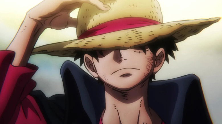
Why’s that? Because Luffy himself is the logo. His goofy grin and straw hat are so iconic that readers instantly get it: this is Shonen Jump, this is One Piece, and this is the issue everyone’s going to be fighting over at the convenience store. So let’s break down what exactly this means, why One Piece was treated so special, and whether other legends like Naruto, Bleach, and Dragon Ball ever enjoyed the same treatment.
From Shonen Jump to One Piece Jump: Luffy Breaking the Logo Rule
Jump has always been fairly serious with its branding, you know? The whole attitude is extremely no-n onsense: big, bold logo and completely impossible to miss. When Jump was going up against other manga magazines in the past, that eye-catching masthead at the top of the magazine was basically saying like, “Hey, this is the new Jump issue you love.”


Then One Piece by Oda Eiichiro came along, and Luffy’s face suddenly had just as much (or rather, more) of an appeal as that huge masthead. According to @pewpiece on Twitter, the editors themselves admitted:
We have a strict rule that the Weekly Shonen Jump logo must always be as large and visible as possible. However, when it’s a One Piece cover with Luffy on it, his presence alone makes the issue instantly recognizable as Weekly Shonen Jump so the logo visibility rule doesn’t really apply in those cases.
Basically, Jump trusted Luffy so much that his mug could replace the masthead. That’s like Coca-Cola saying, “Forget our logo, just put Santa Claus holding a Coke bottle, and we’re good.”
Now, if you check out all those Jump covers from over the years, you’ll see something cool: One Piece didn’t just appear on a lot of covers, it totally owned them. Sometimes, Luffy is so huge and right in your face that the Jump logo looks like a little decoration in the corner.
During anniversaries, movie promos, or major manga storylines, the whole cover is pretty much just one big Luffy poster, with the logo doing its best to sneak in there. This is how powerful Oda’s pirate crew became. For fans, grabbing the magazine with Luffy’s face was a no-brainer. You didn’t need to look at the logo. The character was the brand.
Did Naruto, Bleach, and Dragon Ball Ever Get the Same Love?
Alright, here’s where it gets good. Naruto, Bleach, and Dragon Ball were all huge, game-changing series on their own. But do you think the Jump editors broke that sacred logo rule for them like they did for One Piece? The short answer: not really, at least not exactly the same way.

Naruto had a ton of covers, especially for major arcs like Pain’s Assault or the finale, but the Jump logo always stayed large and prominent. Even for single-main-focused covers of Naruto, the editor didn’t exactly downsize the logo that much.
Bleach got stylish covers (especially with Ichigo’s slick poses), but again, the logo always held its ground. Bleach was cool, but not quite ‘overshadow-the-logo’ cool. Dragon Ball is a bit of a special case as its covers run from the 80s and 90s, which was a period where the rules of design weren’t that strict either.
While some Goku covers went big with massive character art, the masthead still managed to stay bold and eye-catching. So while these franchises got their shine, Luffy is the only one who repeatedly turned the logo into an afterthought.
So why did Oda’s pirate boy receive special treatment? It’s fairly simple: he completely dominates the pop culture. By the mid-2000s, One Piece wasn’t just a manga; it was like the biggest thing in Japan. Everyone knew who Luffy was.
His face sold all kinds of stuff, books, DVDs, toys, movies, and even theme park rides. When you’re that famous, you don’t even need a logo; just the outline of your character can sell anything.
So the next time you spot a Jump cover whose logo appears to be slightly smaller than normal, just keep in mind: the editors didn’t make a mistake. They had it planned. Because when Luffy smiles on the front cover, everyone already knows it’s the magazine.
One Piece manga is currently available to read on Viz Media, and the anime is currently available to watch on Crunchyroll.